Release Notes
Components
Guidelines
Words
Resources
User Lists
User lists are common for those who play on the same team, or follow the same brand. They must remain legible so our users can easily find who they're looking for.
Scale
When choosing the avatar size for each user list, consider the interface as a whole and how it will fit in. Stick with small, medium and large.

Large: When space is plentiful, opt for large user lists that list primary, secondary and nonessential information in an order.
Usage
List Items
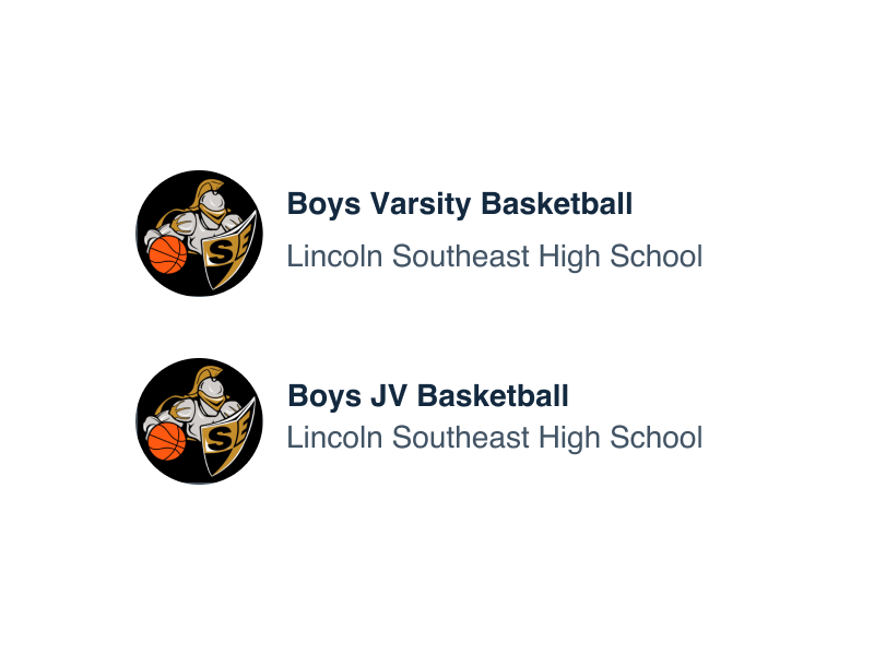
Regardless if the list will display one user or more than fifty, each item should be identical. In some cases the list may grow over time, like when a user joins another team. There is no minimum list requirement to use this pattern, but be wise when displaying long lists.

Don'tforce the user to scroll through infinite lists to find who they’re looking for.

Douse search and scrolling to easily find people.
Layout
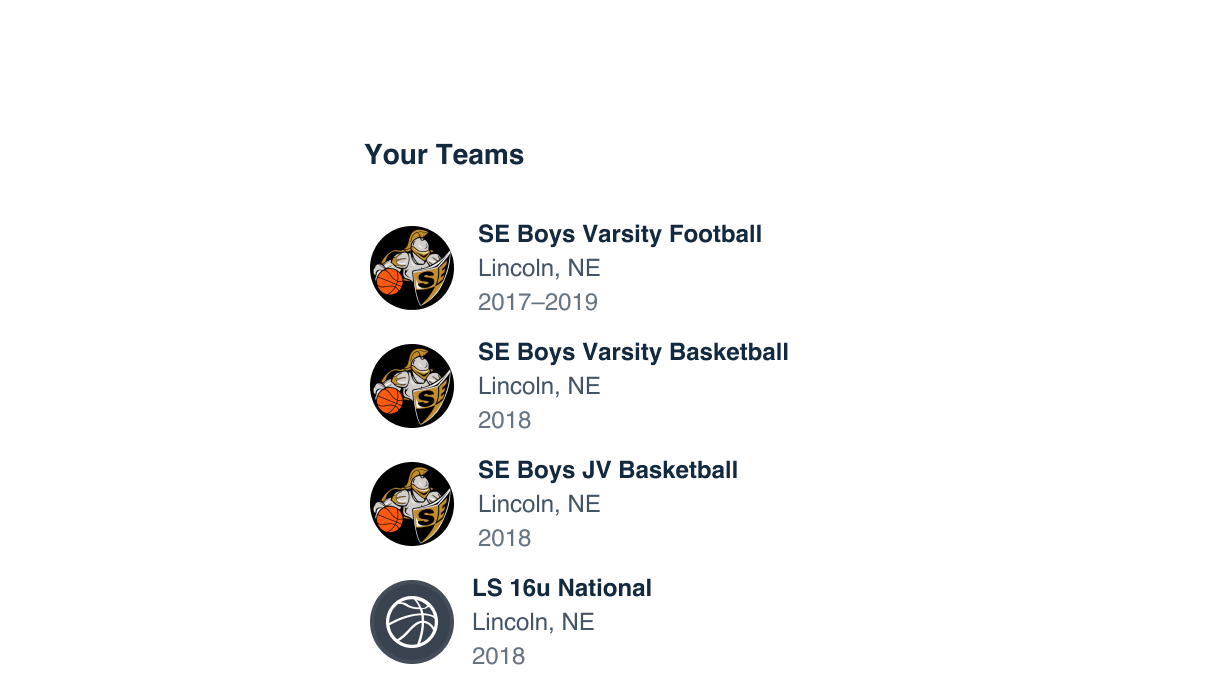
User lists should always be displayed vertically. Vertical space is abundant on both the web and mobile application, and scrolling is second nature. Don’t go against the grain and display user lists in unexpected layouts.

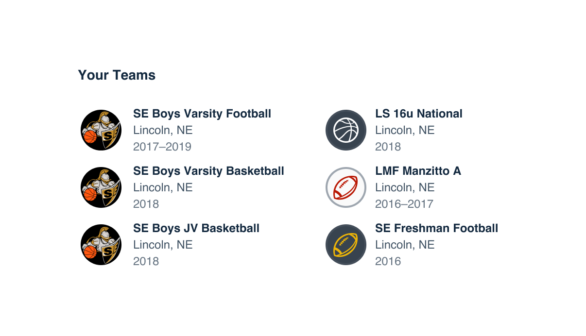
Don'tformat user lists in multi-column layouts.

Dodivide items in long lists.
Microcopy
Hierarchy
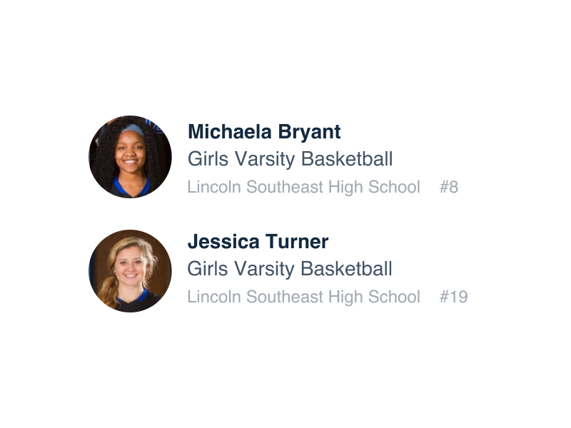
Each item in a user list should repeat the information in the same format, in proper hierarchy. Primary information should always appear first, then secondary, and finally supporting, nonessential information (if applicable).

Don'torganize content in a random order.

Douse nonessential text to support the information hierarchy.
Limit Information
Depending on the context of the list, it’s easy to accidentally cram in a lot of relevant information. Be intentional with what is displayed and choose to limit to the most important pieces of content.

Don'toverload the list item with all available content.

Dopick and choose the most important pieces.
Content and Color
Use text for all content in a user list. Make use of small and micro sizes, both in default and bold weight. To further emphasize each piece of information, stick to using Contrast, Default and Nonessential content colors.

Don'tmix and match text sizes.

Dofollow a consistent format for each.

Don'tuse one color for all elements in a list.

Douse content hierarchy to inform color choice.

Don'tswitch up content that the user can interact with.

Dokeep interactions between items orderly.