Release Notes
Components
Guidelines
Patterns
Words
Resources
Tooltip
/
Design
Display a brief message on hover.
The tooltip appears when a cursor is positioned over an icon or button. There's only one type, always anchored to the element by a small tail.
Options
Types
Depending on the context, a tooltip may need to act a specific way. The instructional type allows for more context, while the label clearly states the action performed.
Instruction: Provide further explanation for the actions that need it.
Triggers
Icons: Provide more detail in a visually dense interface where we may not have room for labels.
Position
The tooltip’s position is dictated by the interface design. Avoid hiding other key elements or getting cut off by an edge.
Delay
Mobile
Tooltips should not be used on mobile. Instead, use a note to explain what the user needs to know.
Usage
Hover Required
The tooltip appears on hover by default, but should also be triggered on focus. Tooltips should never appear without a trigger, especially not as onboarding prompts.
Type Treatments
There’s a hard limit of one bold or italicized phrase—not complete sentence—per tooltip. Use it to call out another element (clips, playlists, etc.) or the desired action.
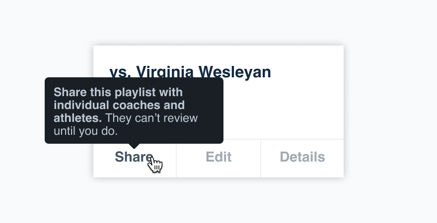
Don'tbold an entire tooltip.
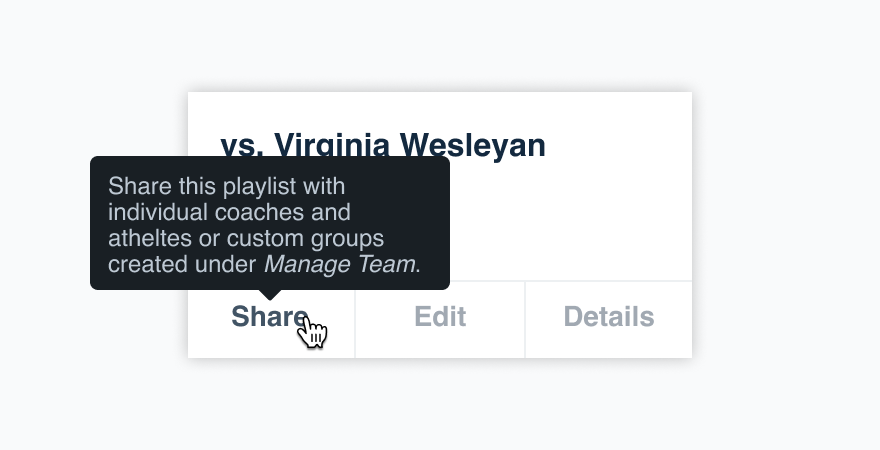
Dobold or italicize a single important piece of information.
Metadata
Don’t use a tooltip to display metadata, like viewing activity for a specific team member. The content should relate directly to the interface element, not provide new information with zero context.
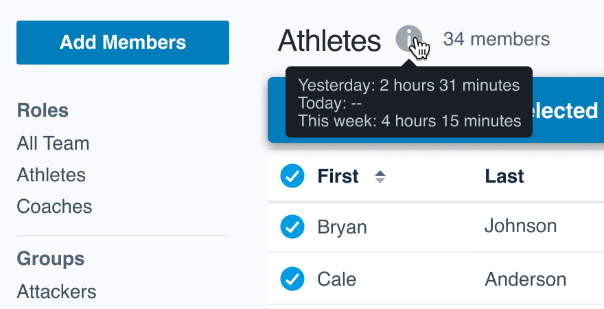
Don'tpack the tooltip with data they may not expect.

Docenter the content around the trigger itself.
On Links
Because we link the action and/or where a link takes the user, there’s no need to include a tooltip where that same information would be shared. Avoid tooltips on links altogether.
In Forms
Tooltips should not replace help text on form inputs—the help text should communicate exactly what the user is submitting.
Radios and checkboxes, however, can use tooltips to communicate what a user is selecting.
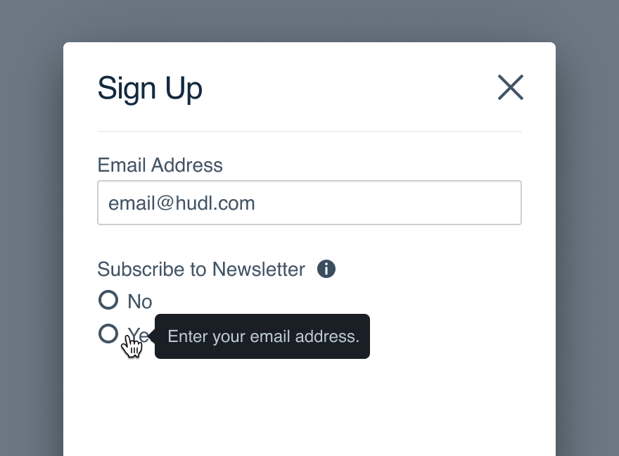
Don'tuse a tooltip in addition to help text.
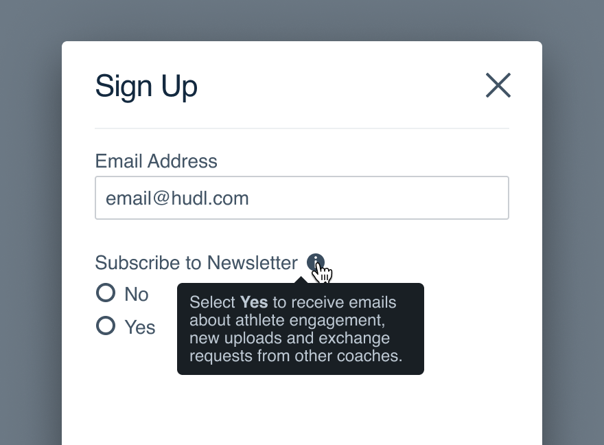
Dohelp the user understand their decision.
Disabled Buttons
Use a tooltip to explain why the button is disabled and provide clear direction for moving forward.
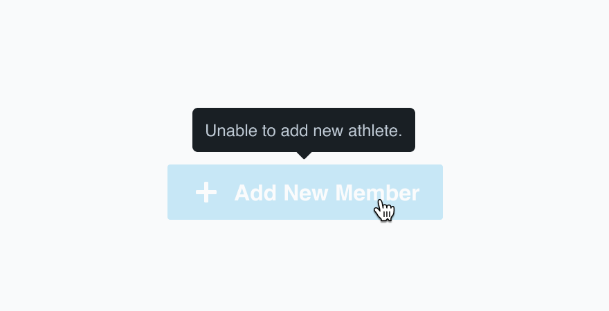
Don'tsimply say that the button is disabled.

Doprovide more context around what enables the button.
Instructional vs. Label
The tooltip type is defined by the information it's presenting.
Don'tuse an informational tooltip to simply name an icon.
Douse a label when no additional instructions are needed.
Don'tmake the label a complete sentence.
Domake it a single action and stick to UI label guidelines.
Abiding by UI label guidelines also means no icon label should have closing punctuation.
Microcopy
Content Length
Tooltips should be no longer than 110 characters. That comes to four full lines for an effective message.
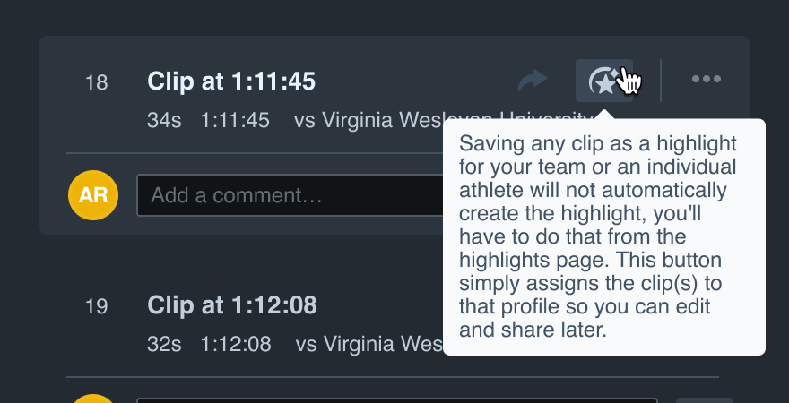
Don'tramble and take up a quarter of the interface for a quick FYI.
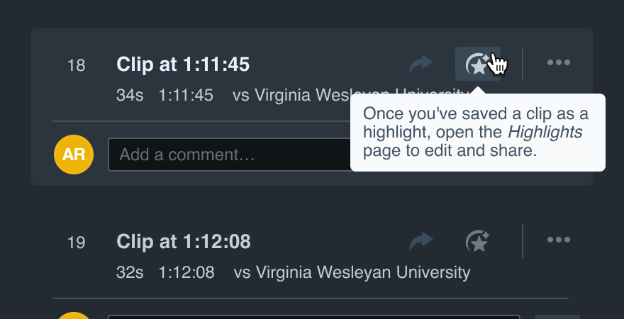
Dobe as clear and concise as possible.
Be Direct
Tooltips don’t require fun phrases or a full shot of personality, just tell the user exactly what they need to know. Inform them and move on.
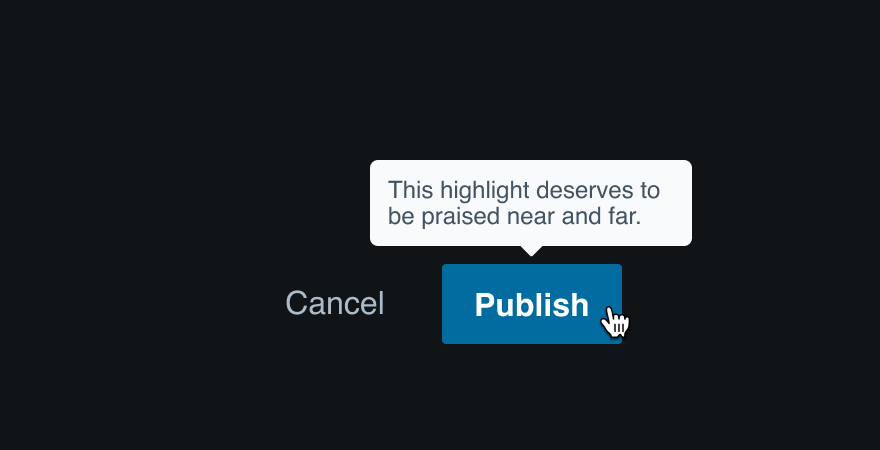
Don'tgo crazy with a casual tone and miss the point.
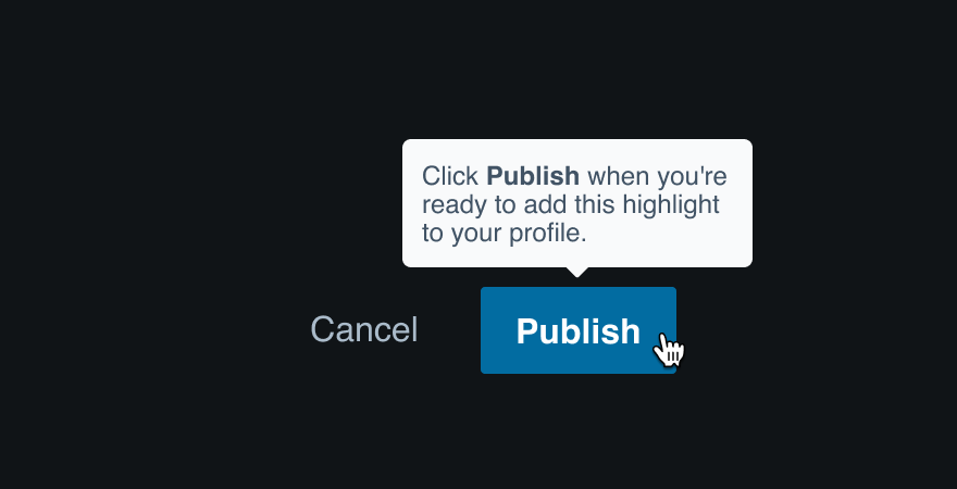
Dofocus on the most necessary information.
Linked Text
A tooltip should never take the user somewhere else—all necessary information should live in the tooltip itself (for the sake of context more than anything). Don’t link the text.
Punctuation
Only periods are allowed in tooltips. We shouldn’t use the limited space to yell with an exclamation or ask questions with no answer.
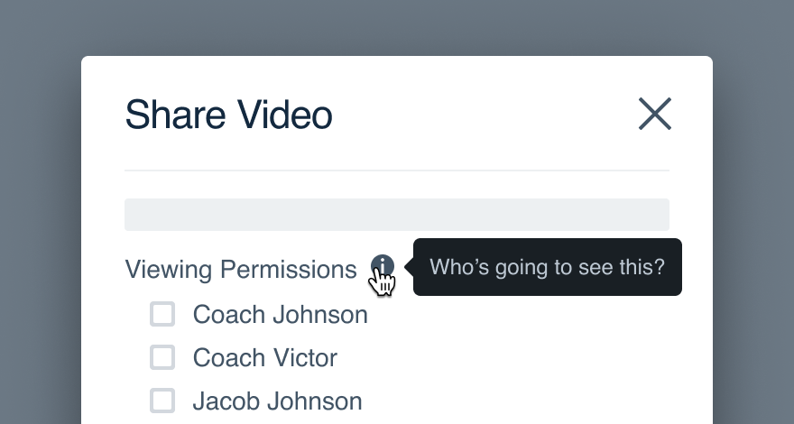
Don'task a question when we can't fit an answer.
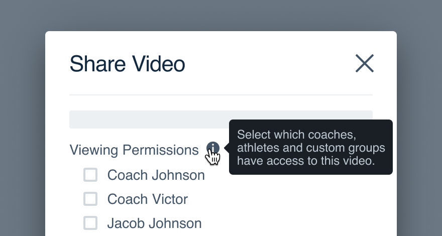
Douse a period to instill confidence in the complete thought.
Accessibility
Audit Results
See our full accessibility audit for more information about these results.
| Platform | Visual | Interactive | Automated | Details |
|---|---|---|---|---|
| React | Pass | Violations | Pass |
|
Platform
| platform | notes |
|---|---|
| Web |
|
| Apple |
|
| Android |
|
| No guidelines exist for other platforms (yet). |