Release Notes
Components
Guidelines
Patterns
Words
Resources
Division
/
Design
Create separation to further connect or distance individual elements.
Division clarifies relationships between sections. It reinforces cohesion across the interface, isolating like content and calling out changes in context.
Intensity
Related elements often appear close together, while those less connected sit farther apart. Space naturally communicates those relationships and should be used to subtly divide parts of the interface.
For more intense divisions, there are lines and levels.
Content Type
Yesterday
Last Week
Empty Space: Use space itself to divide related information within a container or create groups of associated content.
Usage
Start with Space
It can be tempting to gussy things up with a visual flourish, but we should always start with white space and gradually add elements to intensify any necessary divisions.

Don'tstart with the most intense level of division.

Dodivide with white space and work your way up.
Avoid Shadows
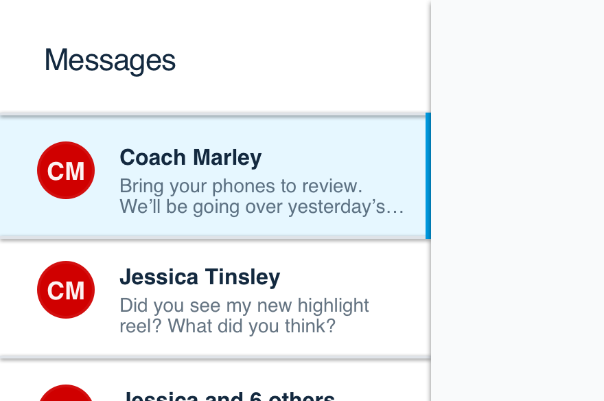
Shadows are meant to differentiate multiple layers within an interface. They should never be used to divide elements sharing the same layer.

Don'tseparate content with shadows.

Dobreak apart content with levels and accent dividers.
Platform
| platform | notes |
|---|---|
| Web |
|
| Apple |
|
| Android |
|
| No guidelines exist for other platforms (yet). |