Release Notes
Components
Guidelines
Patterns
Words
Resources
Color
/
Design
Rely on Uniform colors to build accessible user interfaces.
The Uniform color system has been extensively tested to ensure text and content maintain proper color contrast ratios for low-vision and colorblind users.
Accessible Color Rules
Adhere to the following criteria around using color in interfaces, provided by the Web Content Accessibility Guidelines (WCAG):
Sensory Characteristics
According to WCAG 1.3.3 (Sensory Characteristics), instructions for using or understanding content on the page cannot rely on color, size, visual orientation, shape, or sound. For example, instead of telling a user to "press the blue button on the right to continue," tell them to "press the 'Submit' button to continue."
Use of Color
WCAG 1.4.1 (Use of Color)requires that color cannot be the only visual means of conveying information, indicating an action, prompting a response or distinguishing a visual element.
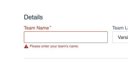
Don'tuse color alone to indicate error states.

Douse icons with color to show an error.
Text Contrast
WCAG 1.4.3 (Contrast Minimum) sets a minimum color contrast ratio of 3:1 for bold text at least 18.5px or non-bold text 24px and above. For all other cases, minimum color contrast ratio should be 4.5:1. Use a tool like the Figma Stark plugin to check color contrast of custom colors. If your project uses Storybook, test the built interface using the Accessibility add-on panel to find any violations.

Don'tuse text colors that don't meet the contrast requirements.

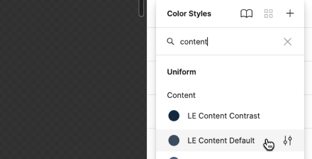
Douse Uniform colors whenever possible.
Non-text Contrast
The other color contrast rule, WCAG 1.4.11 (Contrast), requires that non-text colors that appear adjacent to each other in interactive elements and meaningful graphics have a 3:1 color contrast ratio. This rule applies primarily to fills, borders and outlines on interactive elements like buttons, or larger graphics that use color to show different fields or values. Most of these cases are handled within Uniform components, but you may need to test color ratios using the Figma Stark plugin when designing custom graphics or data visualizations.